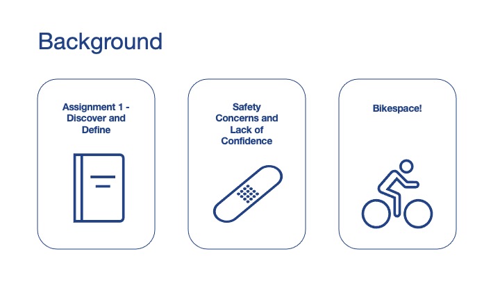
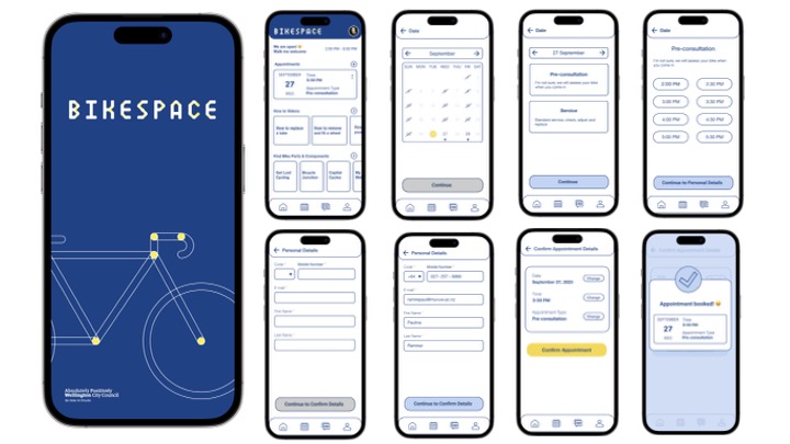
Bikespace
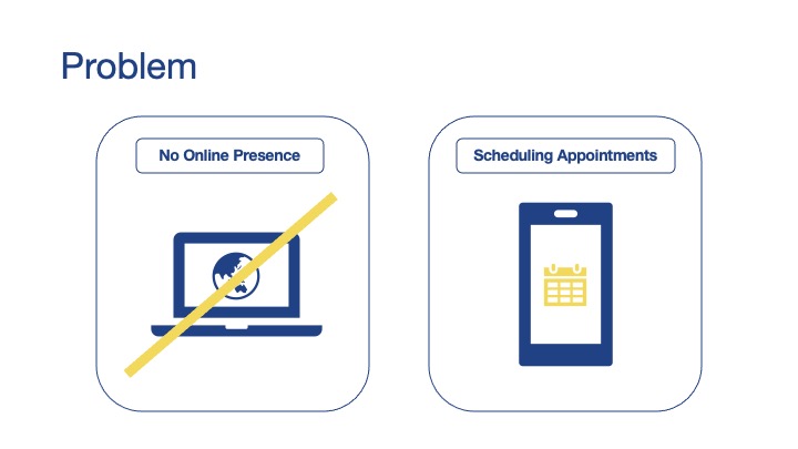
Bikespace lacked an online presence, limiting user engagement, appointment scheduling, and communication with local councils.
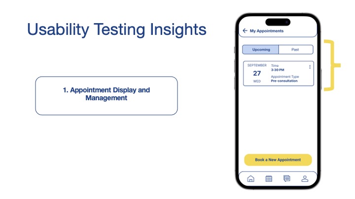
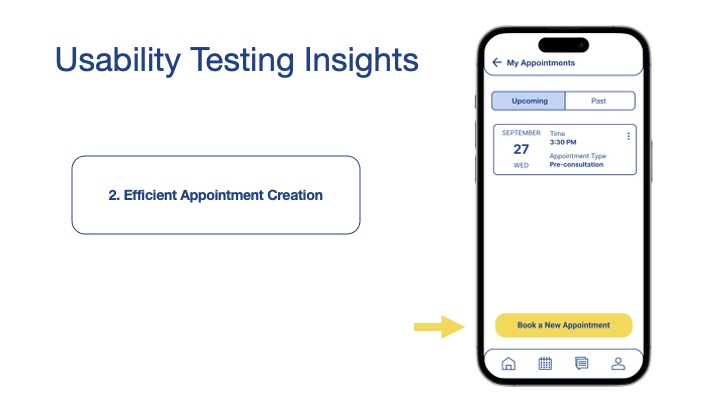
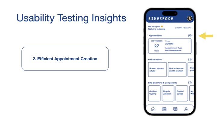
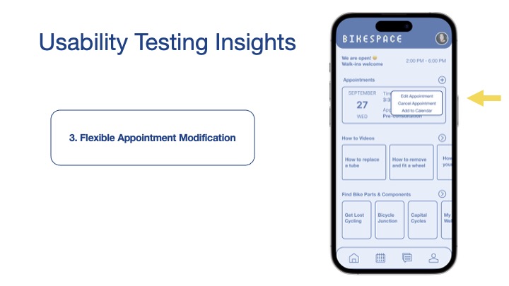
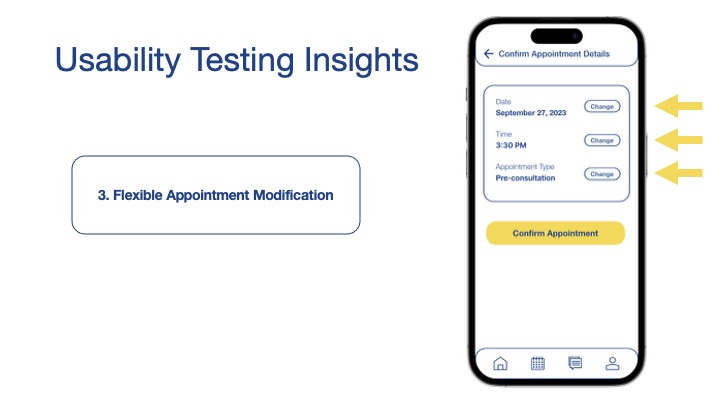
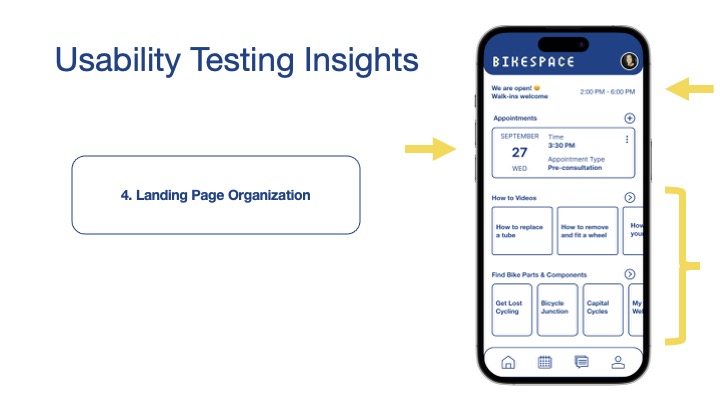
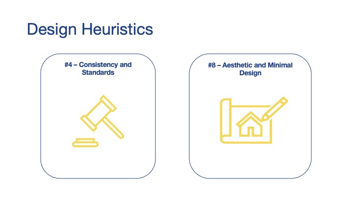
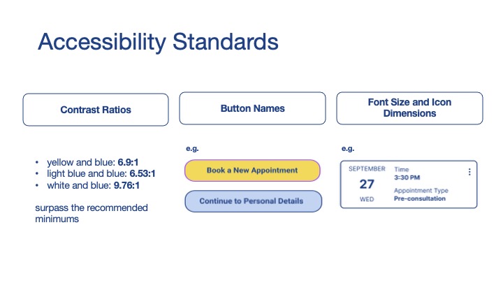
This project addressed usability issues such as scattered appointment details, inefficient booking processes, and a disorganized landing page. Guided by usability testing insights, design heuristics, and accessibility standards, the redesign focused on intuitive appointment management, clear landing page organization, and accessible interactions with high-contrast color combinations, legible fonts, and descriptive buttons.
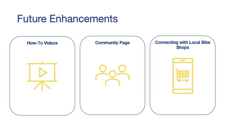
Future enhancements that I would like to include instructional videos, a community discussion platform, and connections with local bike shops to foster engagement, support sustainability, and improve service efficiency.
The project balanced simplicity, functionality, and accessibility to create a reliable, user-centered platform for Wellington's cycling community.